GINO Gelato
Everyone loves Gino
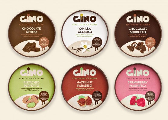
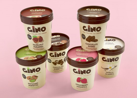
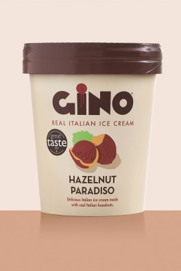
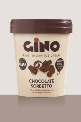
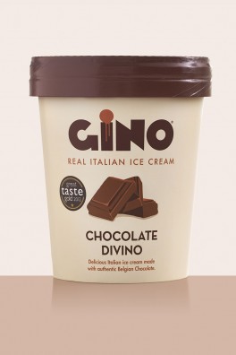
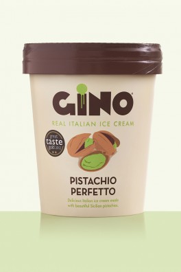
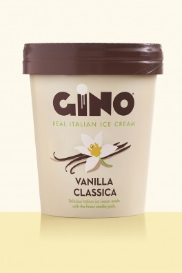
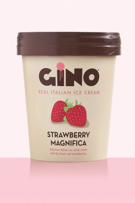
Having developed a very successful wholesale business supplying premium, artisan gelato to cafés, restaurants and ice cream parlours, natural gelato brand, GINO engaged Mystery (who had originally designed GINO’s brand identity, logos, takeaway tubs, cups, signage and interior graphics) to develop the packaging for a new retail range of 500ml gelatos and sorbets.
GINO’s award-winning artisan gelato had previously only sold through wholesale channels, but due to its popularity, the company developed a retail range, consisting of its six key flavours, with the objective of growing a strong retail business to complement their established wholesale one.
GINO Brand Strength
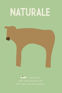
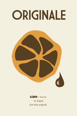
GINO’s popularity and brand strength comes from its unrivalled authenticity, heritage and quality. GINO stands for Gelato, Italiano, Naturale, Originale, with a promise to use only 100% natural ingredients; carefully sourced fresh fruit; 100% fresh British milk and no artificial flavourings, colours or preservatives.
The packaging for its new range of cardboard 500ml retail tubs had to convey these values, together with GINO’s passion, integrity and premium quality.
The challenge for Mystery was to create a range of packaging that would stand out on the shelf amongst its competitors, reflecting the premium nature of the product, yet without appearing too inaccessible and expensive. The budget was tight, and the timeline even tighter!
GINO Packaging Design - concept and inspiration
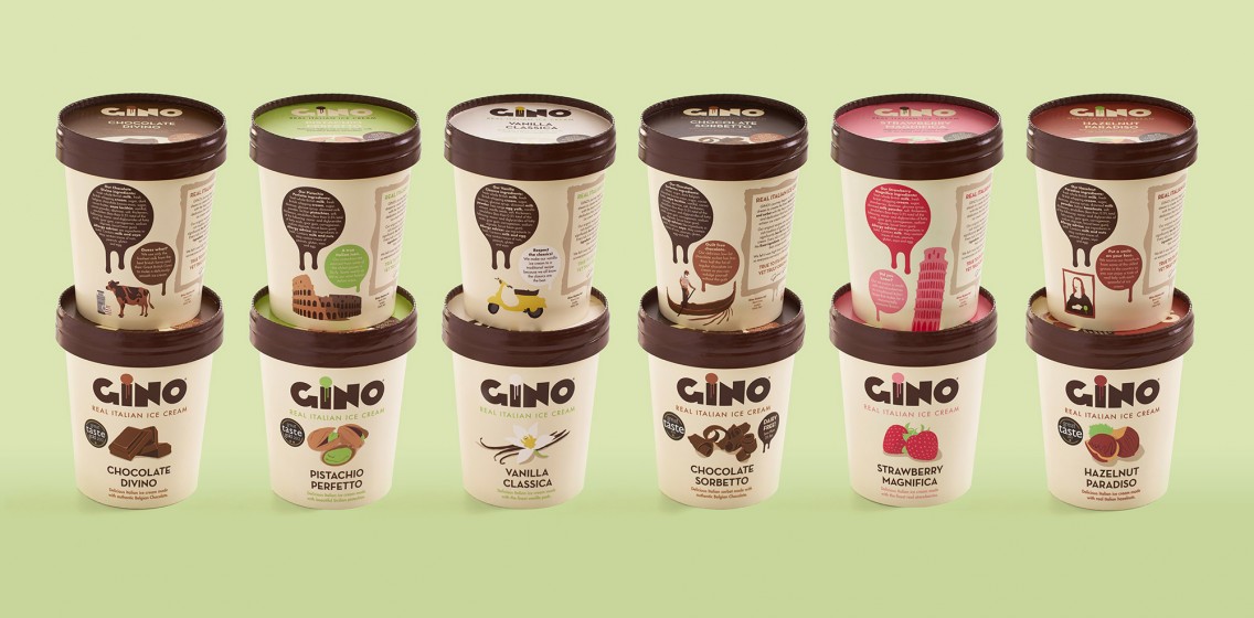
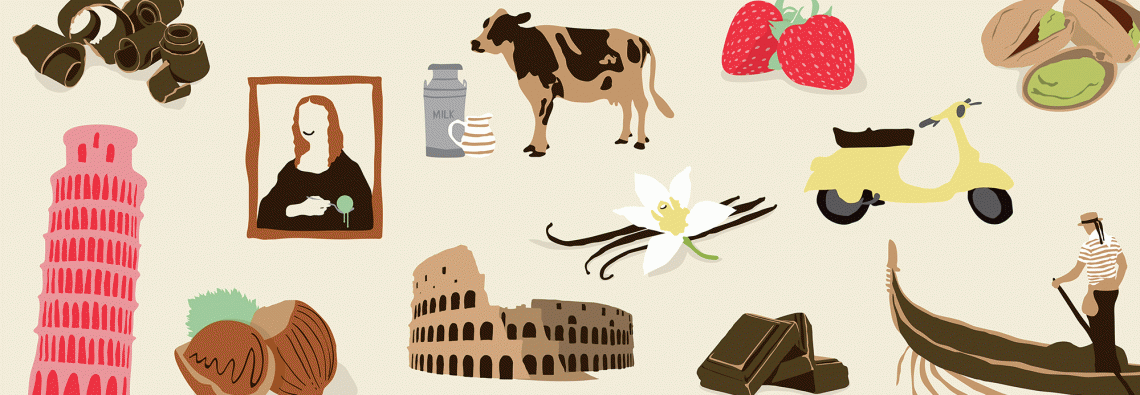
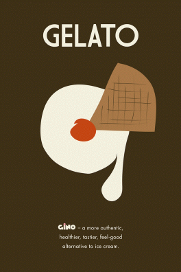
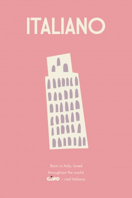
Inspiration for the hand drawn illustrations, by Mystery's own illustrator, was the authenticity behind the handmade, artisanal gelato-making process. It was about creating a link between the two in an illustrative style that also referenced classic Italian poster design from the 1940s.
Typeface choice for the logo was also a reflection of 40s Italian poster design, while the colour scheme appeals to the contemporary consumer and reflected the current business.
The hand drawn illustrations portray a quirky twist on Italian icons, such as the Mona Lisa, Statue of David and the Vespa, comparing them to some aspects of the product or ingredients to marry the brand’s Italian heritage with its contemporary ingredients: The Picture of the Coliseum on the Pistacchio flavour says: “A true Italian Icon. Our pistachios are sourced from some of the oldest groves in Sicily. Some nearly as old as our most famous Italian icons”.
Packaging a business success story
GINO’s new retail range is already being stocked in a number of independent stores, together with Booths high end supermarkets, Budgens, Londis and WholeFoods Market. The brand hopes to confirm shortly its listing in a major national (UK) retailer.
Following the launch of the new retail product. GINO has also won Great Taste Awards, with five out of the six flavours receiving stars - pistacchio, strawberry and chocolate sorbetto receiving 2 stars.
“We have received only positive feedback on the packaging and leading retailers, distributors and food consultants, who have really complimented us on the unique tub designs that make our product truly stand out and perfectly advocate what GINO is all about. All of our core values are skilfully portrayed and reflected in sharp and clear packaging that doesn’t sacrifice any of the many subtleties and peculiarities that make our brand and product so unique.
Despite all the challenges and tight timeframe, the Mystery team showed true dedication, commitment and creative efforts to deliver an end result that we found simply perfect.”
Alessandro Gherzi, Founder, Gino Gelato
