CHOPSTIX NOODLE BAR
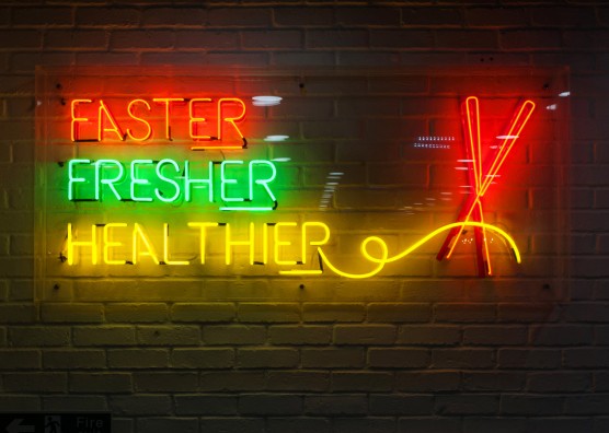
Faster, fresher, healthier
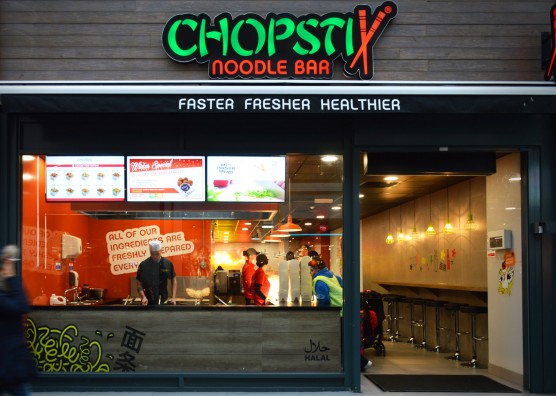
Mystery has worked with the UK’s fastest growing Oriental QSR, Chopstix Noodle Bar to undertake a full re-brand, refreshing Chopstix’ entire UK portfolio, culminating in the launch of its flagship store in London’s busy Oxford Street.
With over 57 sites across the UK and the Republic of Ireland, together with its new partnership with Welcome Break, the newly rebranded, revamped Oxford Street store marks a new era for this emerging Oriental fast-food restaurant chain. As well as rejuvenating the Chopstix Noodle Bar image, the re-brand also effectively launched Chopstix Express and Chopstix Metro.
Tasked with evolving and refreshing the existing identity, branding, interiors and communication and to develop effective franchisee packs, we successfully re-designed the interiors and updated all design and communication to position Chopstix as the faster, fresher, healthier oriental QSR, ensuring it stands out in a heavily saturated and diverse market.
Brand positioning
In order to position Chopstix as the leader in the oriental QSR market, the strategy was to improve customer experience to create a compelling brand that appeals to a very wide audience and competes with the fast-developing market.
The key challenge was to find the right balance between creating an aspirational lifestyle brand experience that would attract new customers and stand out in a competitive marketplace, while striving for a value-driven operation that could inspire and hold on to, rather than intimidate the existing broad range of socio-economic customers.
We focused on creating an environment that aligns with the Faster, Fresher, Healthier food offering and stands out as unique and accessible to multiple age groups and demographics.
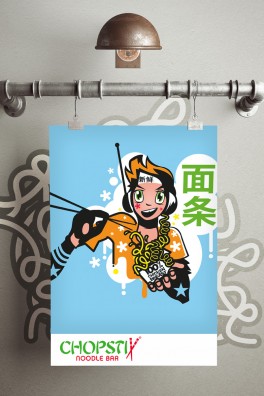
In order to retain some of the much loved heritage of the existing brand, and uphold its current identity and the loyalty of existing customers, some of the colour palette and iconic anime characters were preserved, but re-styled and updated to give them a more contemporary look, while still being welcoming, fun and vocal.
Our core value around the proposition of ‘accessible oriental’ therefore ensured that every aspect of the design reflected this.
We defined the Chopstix archetype to be most closely associated with the “Regular Guy” archetype. This archetype focuses on a genuine approach to life and is approachable, neighbourly, easy-going and without airs.
Straightforward and with no complications, “The Regular Guy” champions consistency, fosters inclusivity and treats everyone as equals, considering all their needs. This is what makes this archetype stand out from the crowd. Translated to the Chopstix brief, the treatment required distinction in branding, interiors and services.
Brand identity
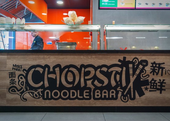
The brand identity refresh and re-design encompassed corporate identity, in-store marketing and digital branding, logos, tag line, business card and stationery for use across all marketing material and websites.
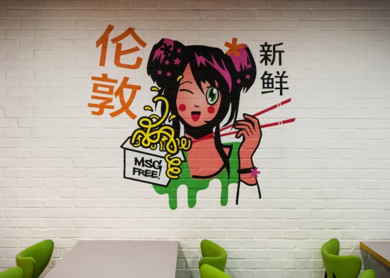
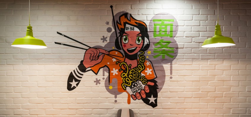
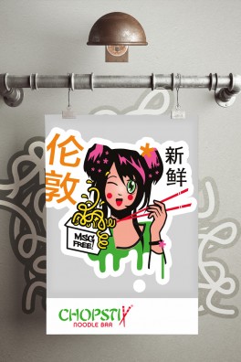
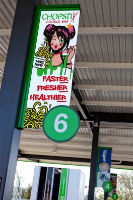
The use of anime and the existing young female face of the brand were both important elements of the former Chopstix imagery that needed to be maintained for consistency of brand image.
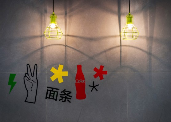
Mystery combined these two elements, creating new brand graphics in a hybrid style that was inspired by anime, but also referenced contemporary UK urban art.
These fantastic, colourful illustrations will resonate with the younger demographic without alienating older customers.
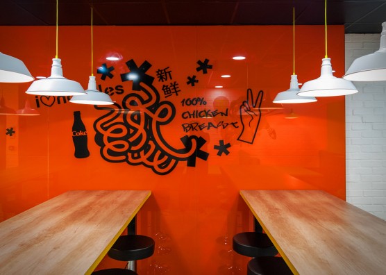
The updated illustrations, together with a suite of brand graphics now appear across all marketing collateral, as well as throughout the interiors scheme.
Additional branding
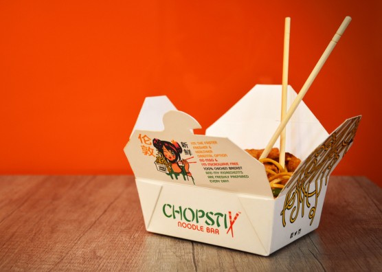
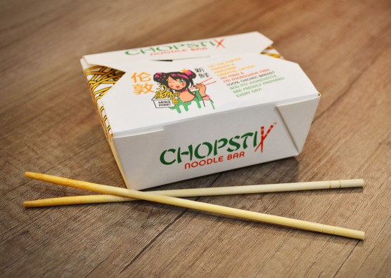
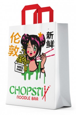
As well as the brand identity and interiors, Mystery also created new in-store packaging stand out cup, noodle box designs, bag, Chopstix sleeve, tray liner plus new staff uniforms.
Interior Design
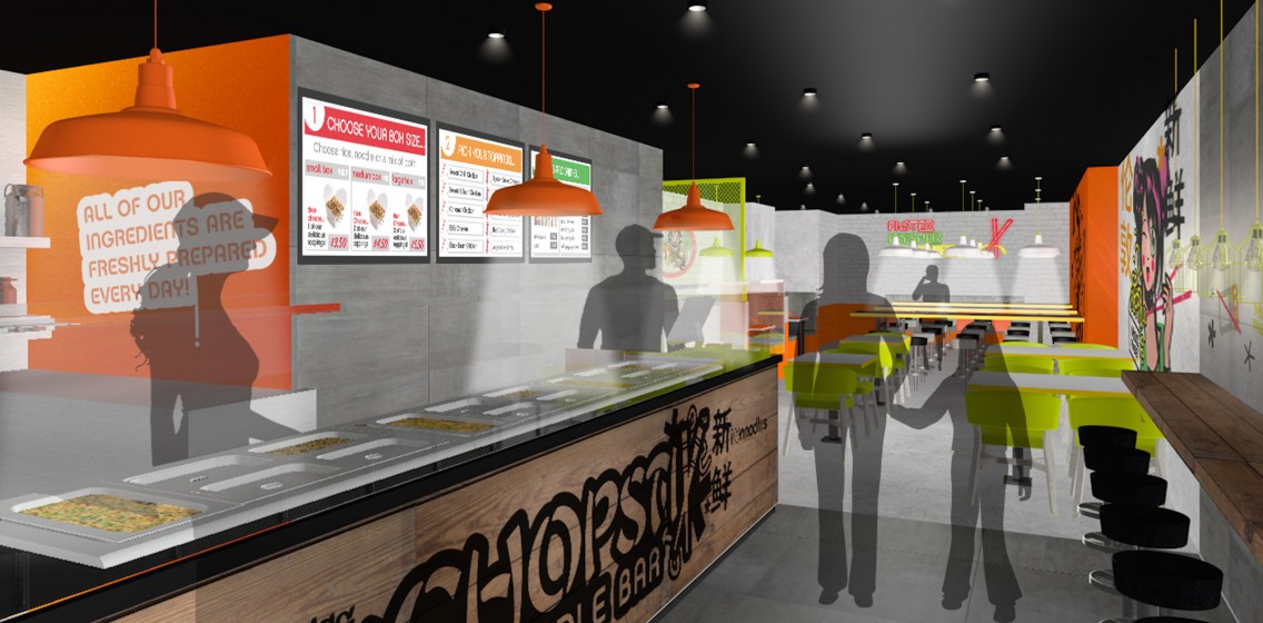
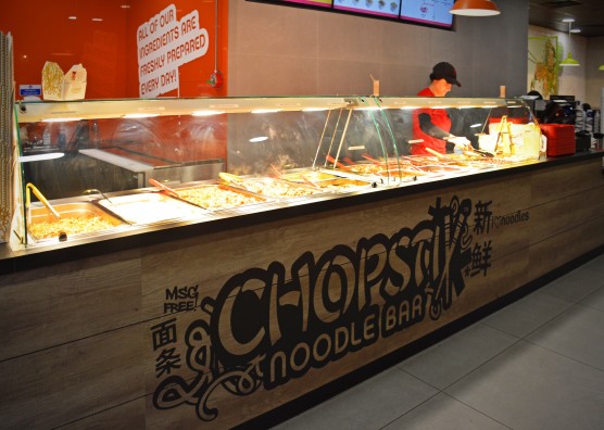
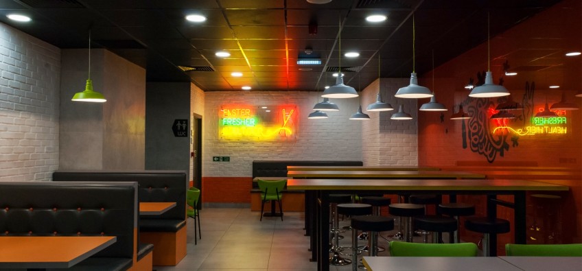
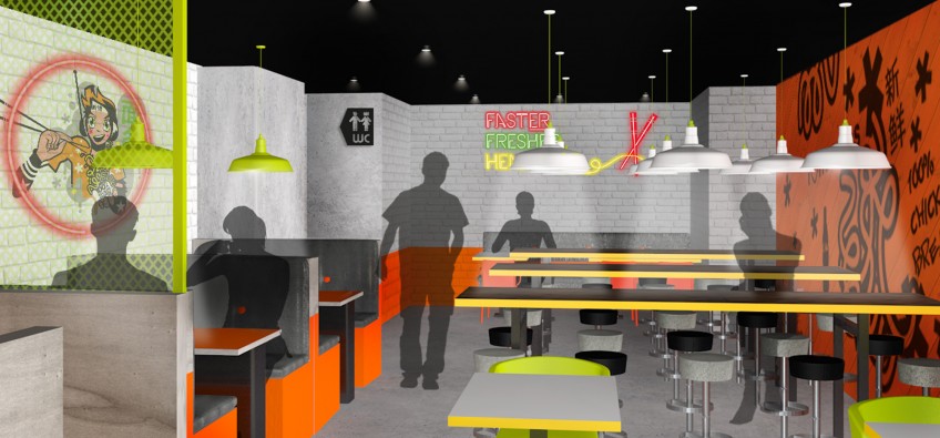
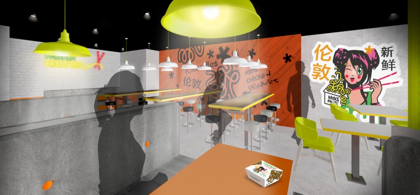
The new interior design is young, accessible, “contemporary-oriental”. Reflecting their company values in their interiors - to be ‘fresher, faster, friendlier, healthier’ – the scheme is upbeat, fresh, approachable and responsive, and features the Chopstix anime girl throughout, for consistency of character and instant brand recognition.
One of the main layout adjustments was to move the counter position to create more theatre in the window, supporting the ‘fresher’ aspect of Chopstix’ brand values.
It was important the space felt accessible to reflect the affordable cost of the product and a key challenge of the furnishing the space was finding cost effective materials; both to support an aggressive franchise model and to ensure the space did not become overly aspirational or intimidating to the lower socio-demographic.
Working closely with the client to understand the order process, we also focused on effective communications to the customer with the use of specially designed digital menu screens that guide the customer through their choices and order.
While Mystery designed, specified and visualised the concept, Chopstix sourced and chose the specified furniture, materials and lighting, carrying out the implementation with their own contractors.
"I can tell you now that the feedback we got (on the new restaurant) was absolutely phenomenal with regards to the look and feel. I think we achieved exactly what we wanted for the flagship and I also think the brand has been scaled down well in our regular stores, so that it still transmits that same idea, but on a smaller scale."
Liora Barron, Head Of Construction, Chopstix Group
Franchisee packs
New guidelines for franchisees were also been created new ‘store packs’, graphics pack and guidelines as templates to provide precise instructions on how to apply the new designs across the three store formats, so Chopstix can easily roll out the designs to new stores and ensure franchisees are on brand.
“Working with Mystery helped us to galvanize our brand DNA and values and to then translate those values into graphic design and guest engagement for site operations, thereby maximizing guest satisfaction.”
Max Hilton, COO, Chopstix Group.
